

Breast Cancer Campaign – London, UK
Life
Changing –
Helping mobilise the brightest minds and biggest hearts to drive world-class Breast Cancer research.
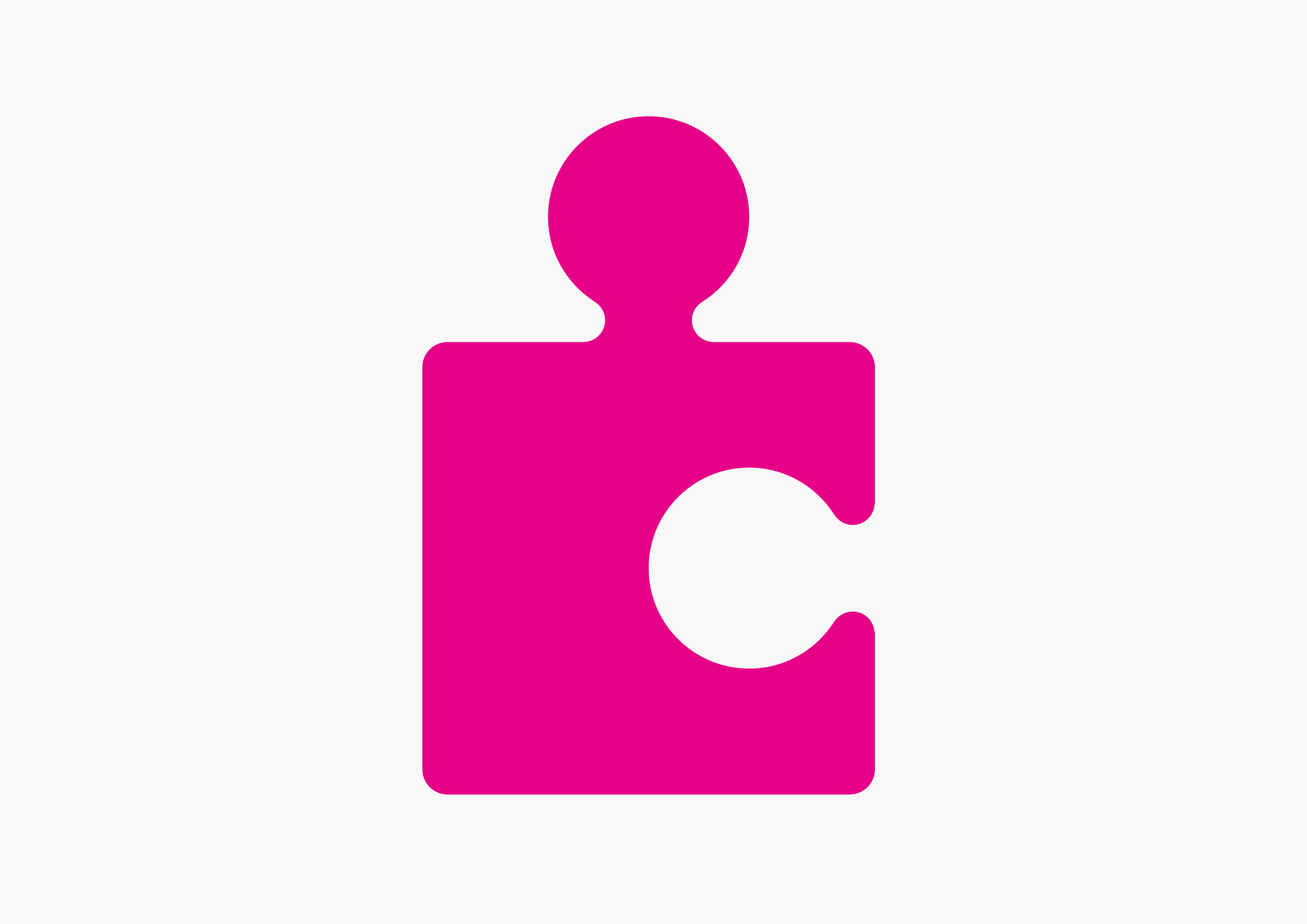
We were honoured to be asked to re-invigorate Breast Cancer Campaign’s branding in partnership with long time collaborator Vincent Design (UK). The key design challenges were immediately obvious, how do you create stand out in a sea of pink, whilst retaining the visual equity of their jigsaw icon in a more dynamic creative way?
We created a new look and feel which brings its research-based focus to the fore in an upbeat and positive way and actually celebrates the somewhat underplayed jigsaw piece as more of a metaphor for togetherness and knowledge sharing.
The redrawn logo has a deliberately more human quality, and highlights patients condition in a modest but powerful way using the negative space within a single jigsaw piece. The logo ‘lock-up’ has been simplified to bring a real clarity to the charities name and also to accommodate an emotive new strapline “Research that saves lives”.
Two modern typefaces were chosen to offer a more contemporary nature to the typography and help articulate both the scientific and fundraising work which Campaign does on a day-to-day basis. A bolder illustrative style has been introduced to amplify the nature of how Campaign works collaboratively and is now an integral element to the new brands longevity. A new colour palette was developed to help emphasise Campaigns passionate and energetic “overcome and outlive” mentality. This resulted in the creation of a more vibrant and resourceful feeling identity and set of communication material.
We are very much look forward to helping Campaign mobilise the brightest minds and biggest hearts to drive world-class Breast Cancer research over the coming months and years.


