Snippets
Snippets is where we share a small part of a much bigger project –
SCROLL, DIGEST & ENJOY
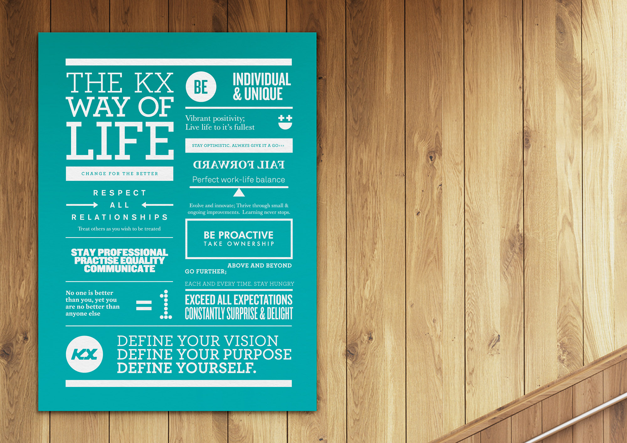
KX Pilates –
We've partnered with KX Pilates for over 6 enjoyable years. Over that time we've developed a vast array of communication material from brand architecture, brand guidelines, interior graphic applications principles and all aspects of graphic design. 'The KX way of life' has to be one of our favourites, applied to every studio: a state of mind as much as a state of body.
Prinfast –
Part of the identity we developed for this large format digital printer based in Lae, Papua New Guinea. A simple idea of colour and repetition used in a bold manner to represent both speed and print.

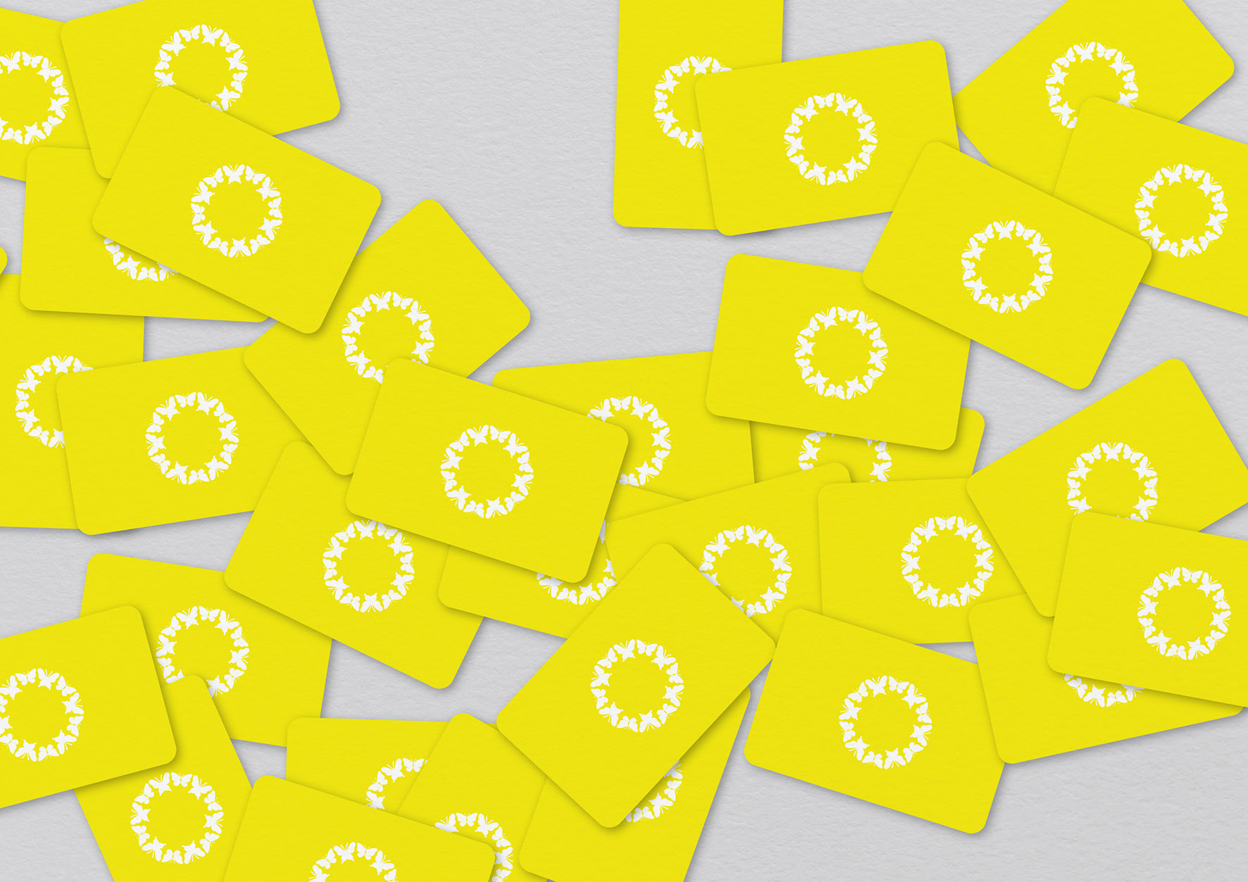
DKF Interiors –
Often the strongest ideas are the simplest. DKF is a boutique residential interior design studio based in Sydney – we developed an identity based on the idea of beauty with form, coming to life visually as a circle of butterflies and aligning with the offer of DKF.
Tiny Tiny Shop Shop –
TTSS is an Australian online store committed to providing a quality range of kids stuff that inspire imaginative play. We developed the name, identity and design system for this wonderful store for little people.

Nous Group –
Nous Group is a leading management consulting and leadership development firm working with clients throughout Australia, Europe and Asia. As par of the full rebrand we developed an idea based on the ability of the consultancy to: 'Getting inside peoples heads – To really understanding what drives people, business and change'. A platform to communicate the unique attributes of Nous with a direct visual interpretation and flexible brand identity. The examples below were developed as part of a full identity system.

Sports Direct –
An online destination dedicated to providing the best sports footwear and apparel available. As part of the project we developed and presented a range of solutions, this being the preferred direction. The simple symmetry and soft colours ensure the symbol achieves a balance between feeling elegant and bold, whilst suggesting movement in the arcs and curves. As is often the case with a start-up or new business, this project hit a few speed bumps along the way and never quite got off the ground.

Origin Energy –
As one of the few select agencies on the Origin Energy roster we developed a wide range of brand and communication material. One aspect that we enjoyed was taking complex data and information and making it easy to navigate visually and interesting aesthetically.

Richie Laface –
Richie is an Australian footwear designer at consultant. The logotype we design for him is a simple play on his surname and the idea of face to face.

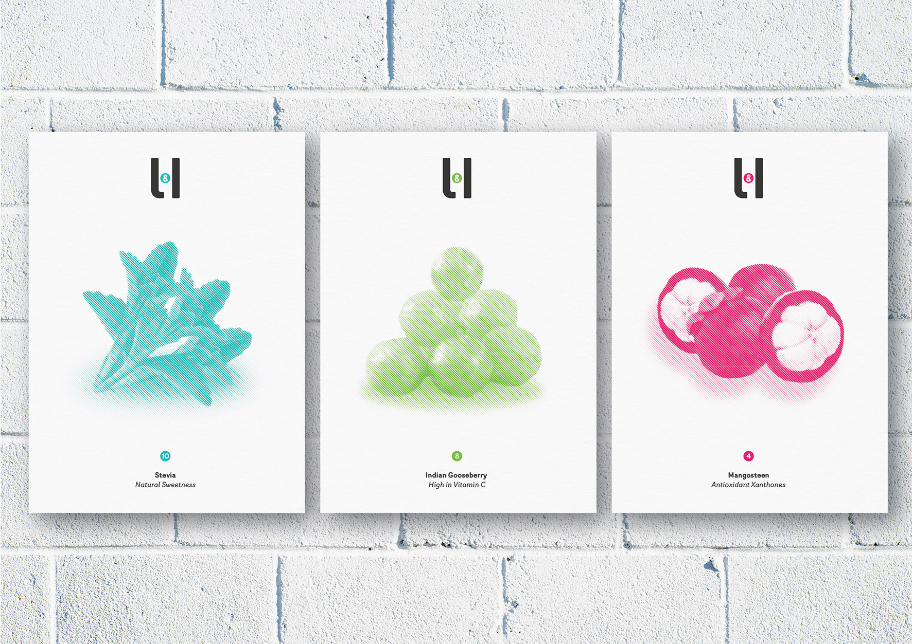
Light & Healthy –
A range of posters designed to showcase the beauty and value of each Light & Healthy ingredient at point of sale. A small part of a full identity system we designed for this 100% Natural Nutrition Supplement.
Merlo –
Merlo Coffee is a speciality roaster based in Brisbane. We were commissioned to bring some clarity and simplicity to the overall brand identity, which had become disparate over time. One of the details we looked at was the logotype, which had been drawn roughly with awkward spacing and odd character height – making it clumsy to look at and challenging to reproduce both large and small. The revised typography is shown applied indicatively to the standard takeaway cup - stay tuned for more.

Ten Lost Tribes –
Part of an identity we developed for cafe serving a traditional range of Middle Eastern Tapas. The name refers to actual tribes from Israeli history, the logo is a simple based on the idea of losing or getting lost.

Yolk –
This one is a little cheeky. Not one to miss an opportunity, we came across a design group called Yolk. We loved the name, but they had missed a trick with the counter of the 'o'. So we sent them our gift...

Jack Harlem –
Jack Harlem is a commercial photography agency based in Brisbane. Owned and run by Josh Kelly, the name for the business came from a chance meeting in New York, with a wonderful homeless man, named Jack Harlem (bottom left). Josh was looking for characters to shoot, they got talking and hit it off, switching stories, chewing the fat and eventually taking a few shots. The identity we developed built on this idea of Jack and the stories and connection they shared. So who is Jack, Jack Harlem is...

EEEG –
Eclipse Early Education Group are a childcare provide with
14 sites throughout Victoria. As part of the full branding project we developed a series of shots featuring beautiful and unique wooden blocks - this tied back to the central idea that every child is totally unique, individual and special. The images were used as part of the wider branding scheme on an array of communications.

Money 3 –
Money3 is a Melbourne based finance company that we created the brand identity for back in 2010. As the project progressed we discovered the name presented a simple gift - the 'm' could be the '3' and visa vera - a simple and trusty-worthy mark with a small quirk.

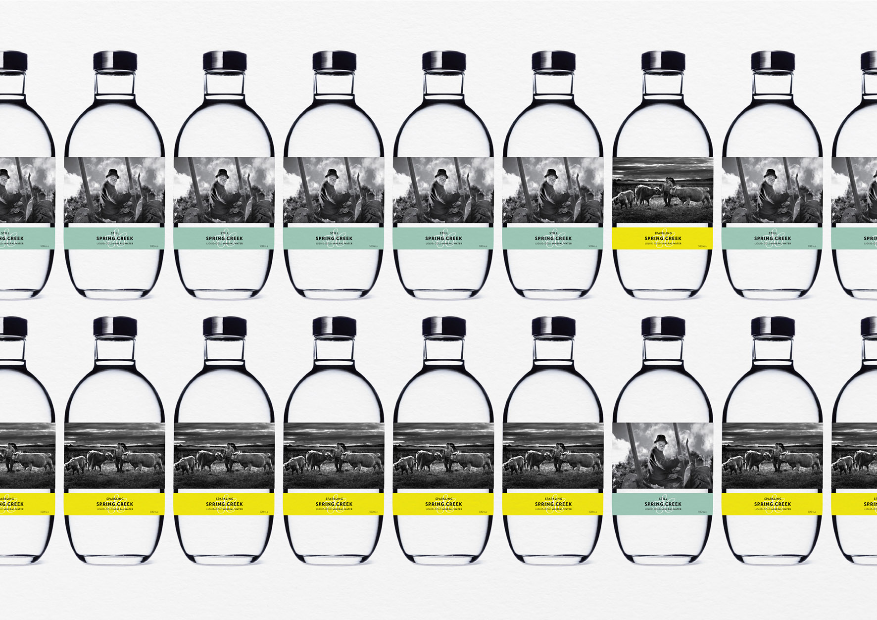
Spa Country Water –
This project was part on an overall identity project for Spa Country – a locally owned hospitality group operating a collection of iconic businesses across Daylesford and Hepburn Springs. Along with
the main identity we were asked to develop concepts for
premium water range, including still and sparkling. Using local heroes we developed a narrative based around providence
and a design solution showcasing the beautiful photography
and strong typography.
FotoFast –
Long live film! FotoFast is part of the Chemcare Group in Papua New Guinea. As part of the total rebrand we relished the chance to design the 'old school' film drop-off envelopes. In a digital age, there's something reassuring and tangible about the idea of film, which we love. The identity is purposefully modernised with the negative space used in the logo to reflect the idea of taking a picture - CMYK becomes the framing device.

Post No Bills –
On a trip to New York we became fascinated by the 'Post No Bills' posters applied liberally and without uniformity. Typographically diverse, from handwritten through to stencil typography, deviod of any design constraints, and better for it. We believe design and language are equally important for communication to be effective and understood - nuances and tone in language are so important. So, who is Bill and why is he so special?

124 Shoes –
We were asked to provide some initial concept work for the logotype for Melbourne 124 Shoes.The idea we developed was a simple one – using pigeon holes as shoe compartments. The creative could stretch beyond the logo, through to playful in-store displays and user centric digital design.

Single Moment –
Trial, error and experimentation are all a large part of the process of design. Sometimes not knowing how an idea is going to turn out, what direction it will take, are all part of the exciting journey. Like the shot below, taken in NZ with a film camera and out of date film not even knowing if it would come out.. It obviously did, capturing and holding a single moment.

Hopscotch Ice Cream –
A simple and memorable identity designed for an Ice Cream shop on the Mornington Peninsula, Victoria. Bold typography arranged with soft colours, referencing the name in arrangement.

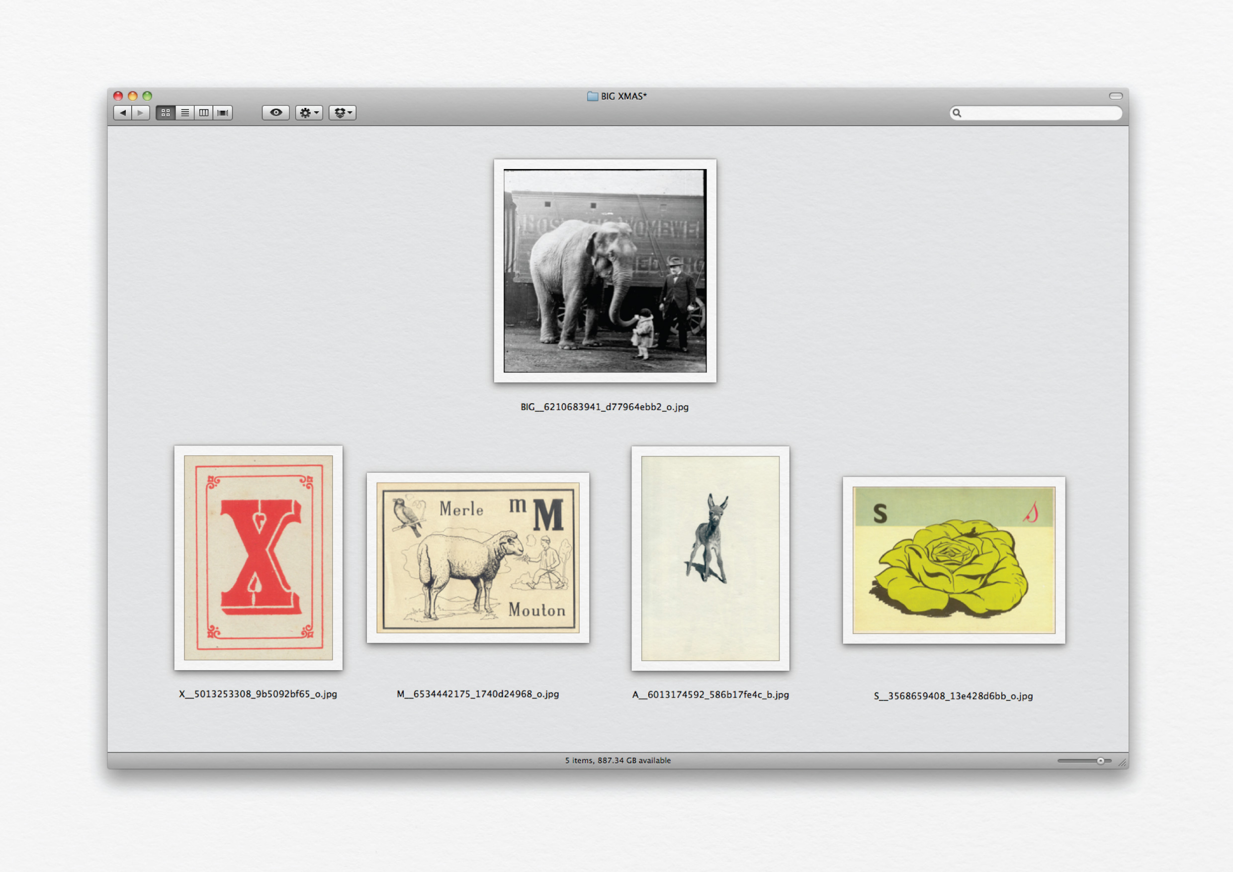
Xmas –
A digital thank you card we send out to clients and friends a few years ago. We wanted to send something playful, characterised by our way of thinking. We loved the idea of a small collection of images that come together to spell out 'Big Xmas'.
Seventeen –
We were commissioned to evaluate and evolve the existing identity of Melbourne based 17 Sports Management. Our recommendations included strengthening the overall presence of the logo and identity, linking it more strongly with the field of sport. Our solution explored team numerals present on players jersey's, leading to the bold typographic solution below.

Ajombi Group –
International consumer research group – an identity based on the four founders which make up the Ajombi name.

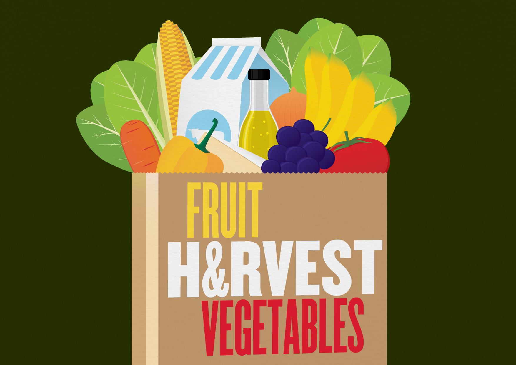
The Harvest –
Playful typographic logotype for
The Harvest Fruit & Vegetable shop.
Courthouse Rocks –
As part of a campaign identity for a local band night we developed a campaign idea around 'rock local' – a play on the 'shop local' movement which is very relevant to the small town of Otley (UK) where the event is held. Bold typography juxtaposed over varied images of the local area.

TL –
Logotype designed as part of a larger identity system for Melbourne Photographer Terence Langendoen – sadly never adopted.

Snooty Wombat –
Cheeky little character and Identity designed for
small online craft store based in Melbourne.

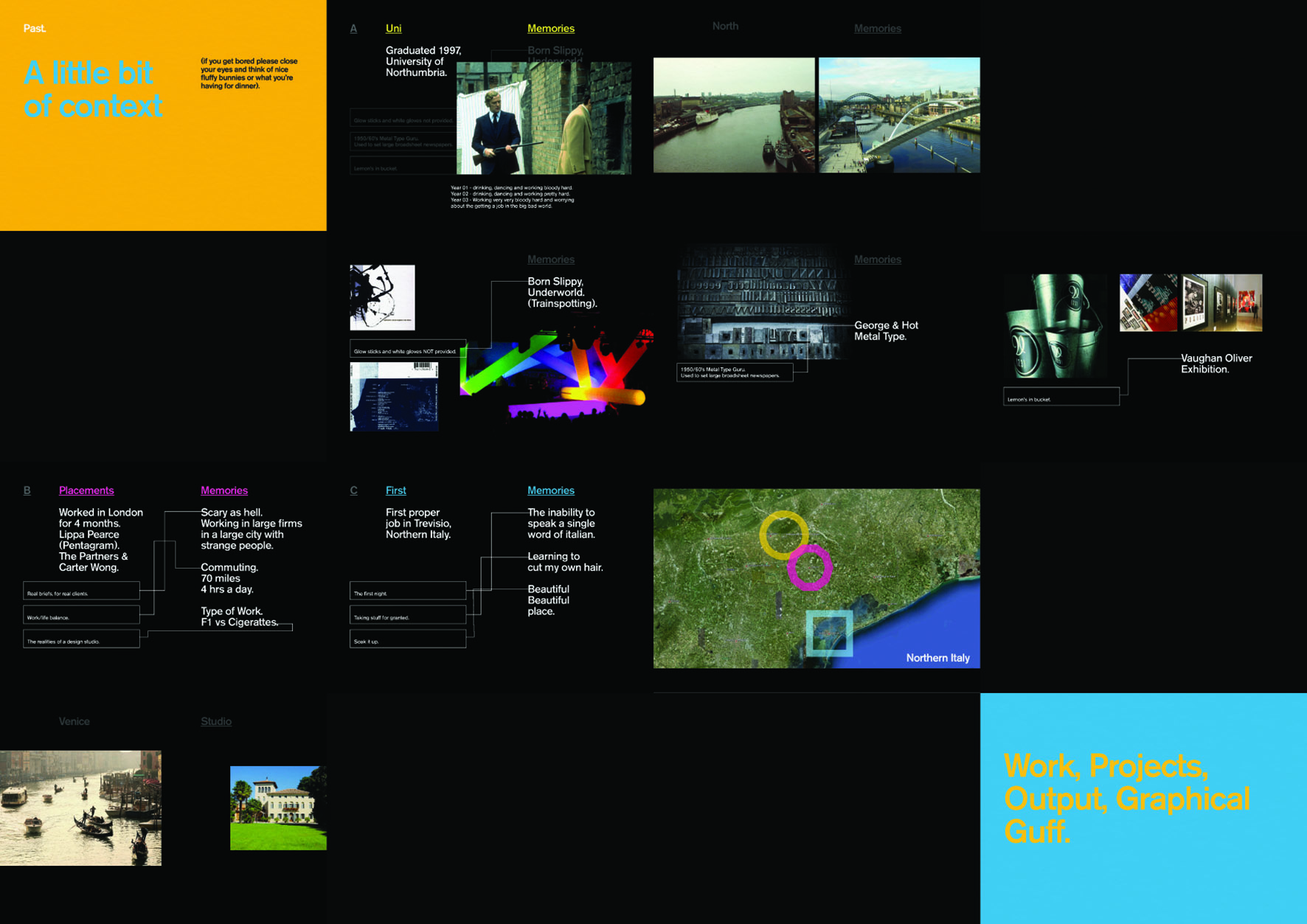
RMIT Presentation –
Part of a presentation to Royal Melbourne Institute of Technology students showcasing a brief history of Kevin's experience and view on the design world at large. One of the inspirational quotes that aligns with our view and approach to design is by designer Fernando Gutierrez – “It all begins with an idea. (ideas make money: money doesn’t make ideas) and you respond to that idea, using your knowledge to present it in the most seductive, engaging manner possible.”